Plotting
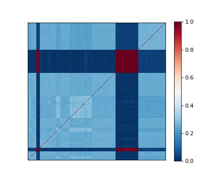
Kinship
We provide a function that cluster rows and columns of a given matrix and plot it using a heatmap plot. This is very useful to quickly visualize the eventual existence of population structure in the data set.
>>> import limix
>>>
>>> K = limix.plot.load_dataset("kinship")
>>> print(K)
[[0.67003303 0.09512837 0.09346511 ... 0.08672590 0.08412999 0.08805045]
 [0.09512837 0.66972454 0.09344451 ... 0.08304282 0.08735654 0.07970102]
 [0.09346511 0.09344451 0.67305621 ... 0.08992310 0.08756828 0.08362728]
 ...
 [0.08672590 0.08304282 0.08992310 ... 0.69345128 0.08846725 0.09457396]
 [0.08412999 0.08735654 0.08756828 ... 0.08846725 0.69414844 0.10091500]
 [0.08805045 0.07970102 0.08362728 ... 0.09457396 0.10091500 0.68948159]]
>>> limix.plot.kinship(K)
(Source code, png)
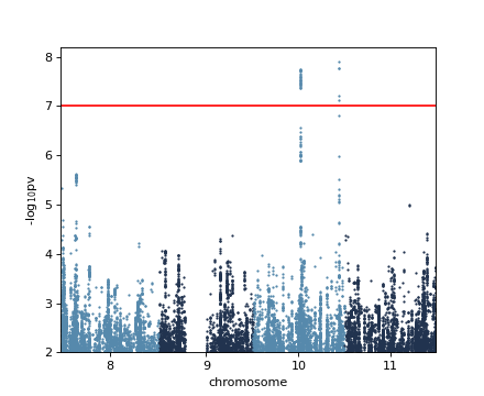
Manhattan
The results of GWAS can be visualized by a Manhattan plot.
>>> import limix
>>> from numpy import log10
>>>
>>> df = limix.plot.load_dataset('gwas')
>>> df = df.rename(columns={"chr": "chrom"})
>>> print(df.head())
    chrom     pos       pv
234    10  224239  0.00887
239    10  229681  0.00848
253    10  240788  0.00721
258    10  246933  0.00568
266    10  255222  0.00593
>>> limix.plot.manhattan(df)
>>> plt = limix.plot.get_pyplot()
>>> _ = plt.axhline(-log10(1e-7), color='red')
>>> _ = plt.ylim(2, plt.ylim()[1])
(Source code, png)
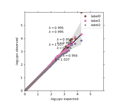
Quantile-quantile plot
A QQ-plot can be used to access the calibration of the obtained p-values.
>>> import limix
>>> from numpy.random import RandomState
>>>
>>> random = RandomState(1)
>>>
>>> pv0 = random.rand(10000)
>>> pv0[0] = 1e-6
>>>
>>> pv1 = random.rand(10000)
>>> pv2 = random.rand(10000)
>>>
>>> limix.plot.qqplot(pv0)
>>>
>>> limix.plot.qqplot(pv0)
>>> limix.plot.qqplot(pv1, line=False, alpha=None)
>>>
>>> limix.plot.qqplot(pv1)
>>> limix.plot.qqplot(pv2, line=False, alpha=None)
>>> limix.plot.box_aspect()
>>>
>>> limix.plot.qqplot(pv0, label='label0', band_kws=dict(color='#EE0000',
...                   alpha=0.2));
>>> limix.plot.qqplot(pv1, label='label1', line=False, alpha=None);
>>> limix.plot.qqplot(pv2, label='label2', line=False,
...                   alpha=None, pts_kws=dict(marker='*'));
>>> _ = limix.plot.get_pyplot().legend()
(Source code, png)
